accesSOS
End-to-end redesign and emergency app launch
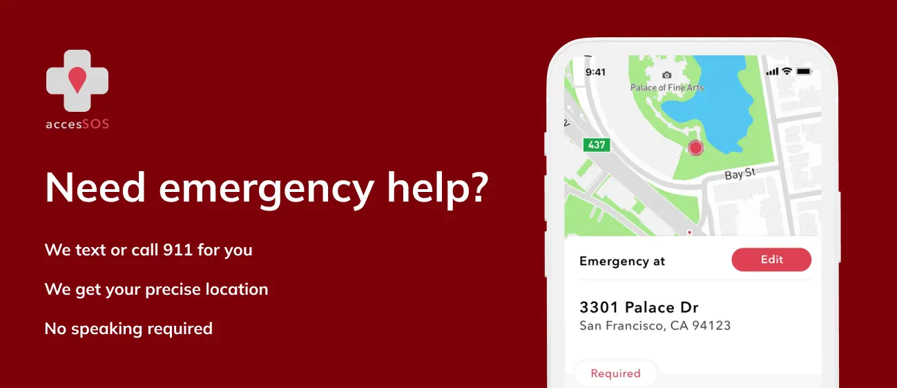
I led the redesign and launch of an emergency app people can use without speaking.
- 14k+New users acquired
- 31Seconds faster to report
- 3Student teams managed
Problem
Deaf and hard of hearing people need a fast, intuitive, and trustworthy way to call for emergency help.
Feedback on the original designs indicated high cognitive load and limited crisis categories. Users weren’t confident that the app would connect them to the right responders.
How might we build trustworthy and efficient emergency response for crises where calls cannot be made?
Original emergency reporting page
The original page had all questions on one page, leading to a long scroll. If user clicked back, all progress would be lost.
User research
I conducted user research and competitor analysis to uncover pain points.
Key insights
- Users want to de-escalate emergencies quickly.
- Mental crisis must be treated as an emergency (not an afterthought).
- Scrolling was confusing and slowed responses.
- Users want to feel like they are connecting to a person, not just a system.
Competitor analysis
- SirenGPS: Quick call button was useful, but tiny text and cluttered UI created confusion.
- TapSOS: Simple, icon-heavy design improved clarity, but lacked guidance for nuanced emergencies.
What I did
I redesigned all user flows, integrated a mental crisis response feature, and conducted usability testing with a focus on accessibility to ensure the app was intuitive and inclusive. I also managed multiple UX research and design initiatives, polished the visual and marketing assets, and worked closely with developers to achieve launch-readiness.
Solution
From insights, I defined principles that shaped the redesign:
- Clarity in crisis: Large visuals, clear hierarchy, minimal text.
- Speed first: One-tap shortcuts for the most urgent actions.
- Intuitive interactions: Familiar gestures like map zooming.
- Trust through transparency: Explicitly show which service is contacted and when.
I redesigned both the mobile web and native apps end-to-end:
- Increased image-to-text ratio and introduced stronger information hierarchy.
- Added a mental crisis pathway to route emergencies to 988 as needed.
- Eliminated scrolling by moving to one question per screen, reducing cognitive load.
- Expanded map size with interactive features.
- Added progress bar and clearer back/forward navigation.
- Prevented errors by disabling CTAs until required inputs were complete.
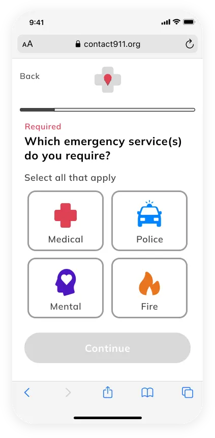
Emergency service selection
Users can choose between Medical, Police, Mental, and Fire emergencies.
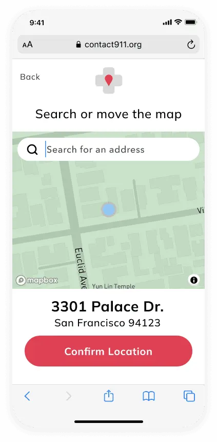
Confirm location
The location is automatically determined via GPS.
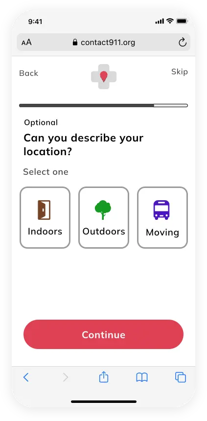
Describe location
Users give more description on their whereabouts to help first responders find them.
Usability testing
Since trust is critical in emergencies, I validated designs with 6 emergency responders and crisis experts (including 2 who were deaf).
Methods
- Usability testing on new flows and mental crisis feature
- Closed card sort to validate emergency category taxonomy
- Affinity mapping of pain points and opportunities
Findings
- New flow reduced confusion and was described as empowering and comforting
- Users wanted more transparency on which service was contacted
- Some category labels needed refinement (“breakdown” = car vs mental health)
- Additional input methods (typing details) were requested alongside button choices
A faster, more inclusive emergency experience built to make high-stakes decisions feel clearer.
What I learned
This project taught me how to design for trust in high-stakes scenarios. I learned:
- Accessibility is not an add-on — it must be the foundation of design.
- Building trust requires transparency and clarity, especially when lives are at risk.
- Leading multiple UX teams showed me the value of mentorship and cross-team alignment.
If I were to continue, I’d explore personalized crisis protocols — tailoring the experience further to specific user needs and integrating additional responder feedback loops.